
Best Free Academic Conference Poster Design Tools Compared (2026)
Your research deserves a poster that stops people mid-stride at a conference session — not a wall of 10pt text that gets glanced at and forgotten. Choosing the right design tool is the first practical decision, and in 2026 the options range from completely free browser-based platforms to specialist scientific illustration suites costing hundreds per year. This comparison cuts through the noise: seven tools, tested against the real demands of academic conference posters — print resolution, scientific-figure libraries, template quality, collaboration support, and total cost.
Whether you are a first-year PhD student preparing your debut poster or a PI reviewing tools for your whole lab, the verdict here is grounded in real feature data and the enduring design principles championed by researchers like biologist Colin Purrington and psychologist Mike Morrison, whose viral #betterposter movement reshaped how scientists think about poster communication.
Full Tool Comparison Table
The table below summarises the seven tools on the criteria that matter most for a conference poster. Pricing reflects the free tier unless otherwise noted. “Publication safe” means figures can legally appear in a published journal article or thesis without an additional licence.
| Tool | Free tier? | Paid from | Scientific figure library | Print-ready export | Custom poster dimensions | Collaboration | Publication safe (free) | Best for |
|---|---|---|---|---|---|---|---|---|
| PowerPoint | With MS365 | ~£5/mo (365) | None built-in | PDF / PNG | Yes | OneDrive share | Yes | Universal fallback; institutional templates |
| Canva | Yes | £10/mo | Limited (icons) | PDF (paid for print) | Yes | Real-time | Yes | Non-STEM; design-forward posters |
| Google Slides | Yes | Free (Workspace extra) | None | PDF only | Yes (up to 72 in) | Real-time | Yes | Zero-cost; team co-editing |
| BioRender | Yes (3 figures) | $35/mo (academic) | 50,000+ scientific icons | PDF / PNG / SVG (paid) | Yes | Lab teams (paid) | No (paid only) | Life sciences; publication figures |
| Mind the Graph | Yes | $5/mo | Scientifically reviewed illustrations, 80+ fields | PDF / PNG | Yes (300+ templates) | Limited (free) | Partial (free tier) | Multi-disciplinary science; budget labs |
| Adobe Express | Yes | ~£10/mo (full) | Adobe Stock (paid) | PDF / PNG / JPG | Yes | Limited (free) | Yes | Design-quality results; Adobe ecosystem users |
| #betterposter (template) | Free | N/A | N/A (layout only) | Via host tool | Via host tool | Via host tool | Yes | Any discipline; maximum engagement |
What Makes a Good Academic Poster Tool?
Academic conference posters have specific technical demands that general design tools do not always address. Before scoring each platform, it helps to state what the criteria actually are.
- Custom dimensions. Standard conference posters run at 36×48 inches (portrait) or 48×36 inches (landscape). Your tool must let you set these dimensions exactly.
- Print-ready export. Images embedded at 72 DPI look pixelated on a large-format print. A good tool exports PDF with vector elements intact or lets you specify 300 DPI rasterisation.
- Scientific figure support. Graphs, diagrams, cell pathway illustrations, molecular structures — for STEM disciplines, a built-in library saves hours compared to hunting down licensed vectors.
- Accessibility of colour palette. Roughly 8% of men have some form of colour vision deficiency. Tools that flag inaccessible colour combinations protect your work from silent exclusion.
- Collaboration. Most posters are authored by a team. Real-time co-editing is a significant time saver in the final sprint before a submission deadline.
- Cost transparency. Hidden paywalls on export — especially watermarks that only appear at print time — are a common complaint. The comparison below flags these explicitly.
The University of Minnesota Libraries’ poster design guide, Yale Library’s academic poster resources, and Brown University’s poster best-practice guide all converge on a short checklist: set dimensions correctly, keep word count under 800–1,200, and ensure all text is readable from six feet away.
PowerPoint
PowerPoint remains the most widely used poster tool in academia, primarily because most institutions provide Microsoft 365 licences at no extra cost to students and staff. It is not flashy, but its ubiquity means that every print bureau, every university IT help desk, and every thesis supervisor knows how to handle a PowerPoint file.
Strengths
- Custom slide dimensions mean you can set 48×36 inches from File > Design > Slide Size, making it fully poster-capable.
- Mature export options: PDF preserves vector elements cleanly; “Save as Picture” at 300 DPI works for raster output.
- Institutional templates are almost always distributed as .pptx files — using PowerPoint is the path of least friction.
- SmartArt, charts, and equations integrate directly without copy-paste errors.
Weaknesses
- No scientific illustration library. You must source or create every figure independently.
- Alignment tools are functional but less precise than Illustrator or InDesign.
- Text rendering at very large print sizes can look slightly rough unless you export as vector PDF.
- No real-time co-editing unless working through OneDrive, which can produce version conflicts.
Verdict: The right choice when your institution provides it and your poster does not require specialist scientific figures. Always export as PDF, not PNG, for large-format printing.
Canva
Canva has become the default recommendation for researchers outside STEM who want a polished poster without a design background. The free tier is genuinely generous: custom dimensions, hundreds of poster templates, real-time collaboration with up to ten people, and PDF export — all at no cost. The interface is drag-and-drop, and the learning curve for a competent first poster is measured in hours, not days.
Strengths
- Research poster templates cover A0, A1, and common US sizes out of the box.
- Real-time collaborative editing is smooth and works reliably in browsers without plugin installation.
- A large icon and photo library covers most social science and humanities needs.
- Free PDF export at standard resolution; Canva Pro ($15/mo or £10/mo) adds print-bleed options and 300 DPI PNG.
- Academic pricing available: Canva for Education is free for eligible institutions.
Weaknesses
- Scientific illustration library is shallow for STEM — icons rather than anatomically accurate figures.
- CMYK colour space is not supported; colours are RGB only, which can shift slightly in professional printing.
- High-resolution print PDF is gated behind the paid plan. Free-tier PDF export is sufficient for most digital sharing and university print bureaus that accept RGB, but not for high-stakes commercial printing.
- Font selection, while large, includes many novelty faces that are unsuitable for academic contexts.
Verdict: The strongest free option for non-STEM disciplines. Humanities, social sciences, education, and public health researchers will find everything they need at no cost. Upgrade to Pro only if you need print-bleed or premium templates.
Google Slides
Google Slides is the zero-cost alternative for researchers who live in the Google ecosystem. Its poster credentials are often underestimated: you can set custom page dimensions up to 72 inches, export as PDF, and collaborate with unlimited team members simultaneously. The University of Minnesota Libraries explicitly recommends it in their poster guide for students without PowerPoint licences.
Strengths
- Completely free — no hidden tiers, no watermarks.
- Best-in-class real-time collaboration with comment threads and edit history.
- Custom dimensions up to 72 inches accommodate standard poster sizes.
- PDF export preserves vector text and shapes cleanly for large-format printing.
Weaknesses
- Only RGB colour space — same limitation as Canva for CMYK printing.
- No built-in scientific figure library whatsoever.
- Limited precision alignment compared to dedicated design tools; “snap to grid” is basic.
- Font rendering at poster scale can appear slightly thinner than in print; always proof-print a section before final submission.
- Large embedded images (scatter plots, microscopy) can slow the editor significantly.
Verdict: The best free option when collaboration is the priority and budget is zero. Not suitable for figures that need scientific accuracy, but perfectly adequate for posters where you supply your own graphs and images.
BioRender
BioRender is purpose-built for life scientists. Its library exceeds 50,000 scientifically reviewed icons covering cell biology, molecular pathways, anatomy, microbiology, and more. For a poster where the visual centrepiece is a pathway diagram or anatomical illustration, no other free tool comes close.
The free plan allows up to three editable figures (reduced from five in late 2025) and permits their use in conference posters for non-commercial academic events. Critically, figures cannot appear in published journal articles or theses without a paid licence — this is a firm restriction in BioRender’s terms, as confirmed by their subscription comparison page.
Strengths
- 50,000+ scientifically accurate icons — the deepest scientific figure library available.
- Poster Builder mode provides drag-and-drop poster layout with figure integration.
- Users report poster creation taking one day instead of a week compared to building figures in PowerPoint.
- Paid academic plan ($35/mo billed annually) includes SVG and high-resolution PDF export, publication rights, and lab team access.
- Some universities negotiate site licences — check your institution before purchasing individually.
Weaknesses
- Three-figure limit on the free plan is restrictive for a data-rich poster.
- Cost: $35/mo (academic) is among the highest on this list. Justified for active lab members; harder to justify for a single conference.
- Not publication-safe on the free plan — a critical distinction many students miss.
- Icons are life-science heavy; coverage in physics, engineering, and social sciences is thin.
Verdict: The non-negotiable choice for molecular biology, cell biology, physiology, and biochemistry posters where accurate pathway diagrams matter. If your institution has a site licence, use it. Otherwise, the free plan covers a single-poster conference trip if you stay within three figures.
Mind the Graph
Mind the Graph positions itself as the scientist-friendly alternative to Canva, combining a drag-and-drop design interface with an illustration library reviewed for scientific accuracy across more than 80 research fields. Its AI-powered poster maker can turn a conference abstract into a poster draft in minutes — a genuine time-saver during the pre-deadline crunch.
Pricing starts at $5/mo, making it the most affordable paid option on this list. The free tier allows poster creation with limited illustration access and export at standard resolution.
Strengths
- Over 300 poster templates covering A4, A0, and custom sizes across disciplines.
- Scientifically reviewed illustrations spanning 80+ fields — broader than BioRender for non-life-science disciplines.
- AI summariser converts a published abstract into a poster draft automatically.
- Accessible free tier with no time limit and no payment card required.
- Editage integration provides expert translation and editing services within the platform.
Weaknesses
- Illustration depth per field is shallower than BioRender’s specialised life-science library.
- Collaboration tools are limited on the free plan.
- The interface, while improving, is less polished than Canva for general layout work.
- Export quality for high-DPI print requires the paid plan.
Verdict: The best budget option for multi-disciplinary scientists. At $5/mo it undercuts every other paid tool significantly. Ideal for researchers in chemistry, ecology, psychology, and medicine who want scientifically reviewed figures without BioRender’s price tag.
Adobe Express
Adobe Express is Adobe’s accessible, browser-based design tool — a lighter alternative to Illustrator that still draws on the Creative Cloud ecosystem. For academic posters, it offers dedicated research and scientific poster templates, 20,000+ fonts, and Firefly AI-generated image integration on paid plans.
The free plan is functional: you can design a full poster, access thousands of templates (including academic-specific ones at adobe.com/express/templates/poster/scientific), and export as PDF, PNG, or JPG. Premium features — including Adobe Stock images and brand kit management — require the paid plan.
Strengths
- Adobe-quality typography and layout precision, accessible without Illustrator or InDesign training.
- Scientific and research poster templates built specifically for academic contexts.
- Export supports bleed addition (increase dimensions by 0.125 inch per side) for professional printing.
- Integrates with existing Creative Cloud assets for users already in the Adobe ecosystem.
Weaknesses
- No scientific illustration library — same gap as Canva and Google Slides.
- Collaboration is limited on the free plan compared to Canva and Google Slides.
- Firefly AI image generation is gated behind paid credits.
- Less widely used in academia than Canva, so fewer community-shared academic templates exist.
Verdict: A strong choice for researchers who want design-quality output and already have Adobe access through their institution. For pure poster work without institutional Creative Cloud, Canva delivers more at the same (free) price point.
#betterposter: A Layout Philosophy, Not a Tool
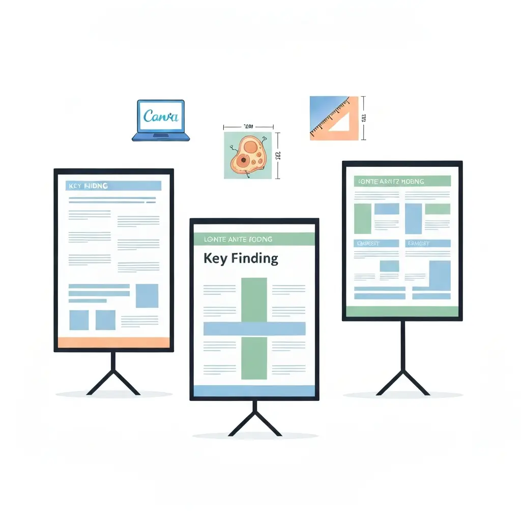
The #betterposter format, created by Michigan State psychologist Mike Morrison in 2019, is not a piece of software — it is a layout philosophy that can be applied in any tool on this list. Its central insight is simple: the traditional academic poster format (multiple dense columns of text) optimises for information density rather than communication efficiency.
Morrison’s redesign places one large, plain-language main finding in the centre of the poster in 80pt+ font, flanked by a QR code linking to the full paper. Supporting data and methodology appear in smaller panels around the edge for interested viewers. The result: a passerby can absorb your key finding in under ten seconds without stopping.
Source: Mike Morrison, PhD — the original #betterposter tutorial (500K+ views) with downloadable templates for PowerPoint, Google Slides, and Canva
- Centre strip (60% of width): Main finding in plain language, large font, high contrast background.
- Left panel: Introduction, context, and methods summary.
- Right panel: Supplementary results, figures, QR code to full paper.
Research presented at the Cochrane Colloquium found that #betterposter-formatted posters achieved significantly higher engagement — more passersby stopped and more conversations were initiated compared to traditional layouts. The Cochrane report is worth reading before your next conference.
Free templates are available for PowerPoint, Google Slides, Canva, and LaTeX. The Open Science Framework hosts the official #betterposter template collection by Mike Morrison — landscape and portrait PPTX files available for immediate download at no cost. The s-ink.org site hosts a widely-used #betterposter template collection and the betterposter LaTeX template on GitHub covers LaTeX users. Applying this layout requires no additional software purchase — only a willingness to break with convention.
Print Specifications: What Every Tool Gets Right (and Wrong)
Choosing the wrong export settings is the most common and most avoidable poster disaster. Here are the non-negotiable print rules and how each tool handles them.
Resolution
Large-format posters are typically printed at 150–300 DPI at full size. A 48×36 inch poster at 150 DPI requires a raster image of 7,200×5,400 pixels. Any embedded photo or raster figure must be sourced at sufficient resolution — blurry figures are a permanent record of a correctable mistake.
- PowerPoint: “Save as Picture” with PNG at 300 DPI is reliable. Export as PDF first to preserve vector elements.
- Canva: Free PDF export is vector where possible. Paid “Print-ready” PDF adds 300 DPI rasterisation and bleed.
- Google Slides: PDF export is the correct route — do not use the PNG export option, which defaults to screen resolution.
- BioRender: SVG and high-resolution export require a paid plan. Free plan is PNG only.
- Mind the Graph / Adobe Express: PDF export is print-capable on both free and paid plans.
Colour Space
RGB versus CMYK matters for professional print bureaus. Canva, Google Slides, and most browser-based tools output RGB only. For accurate colour matching on professional printers, ask your print bureau if they accept RGB PDF (most university print services do) or whether they need CMYK conversion. Colin Purrington’s poster guide at colinpurrington.com recommends printing a test strip before committing to a full print run.
Standard Sizes
Check your conference guidelines before setting dimensions. Common sizes are 36×48 in (portrait A0 equivalent), 48×36 in (landscape), and A0 (33.1×46.8 in) for European conferences. Some venues specify a maximum width — a 60-inch-wide poster sent to a venue with 48-inch maximum stand width is a logistics problem with no good solution on the day.
Our Recommendation by Use Case
| Situation | Best tool | Why |
|---|---|---|
| Life sciences, need accurate pathway figures | BioRender | 50,000+ scientifically accurate icons; no competing tool matches depth in this domain |
| Non-STEM or social sciences, zero budget | Canva (free) | Best template variety, real-time collaboration, clean PDF export at no cost |
| Multi-author team, strict zero spend | Google Slides | Unlimited real-time collaboration, no account required for collaborators, PDF export is print-capable |
| STEM, moderate budget, multiple disciplines | Mind the Graph ($5/mo) | Scientific illustrations across 80+ fields at the lowest paid price point; AI abstract-to-poster feature |
| Adobe CC institution licence already active | Adobe Express | Superior typography, print-bleed support, academic templates included |
| Institution provides MS365 | PowerPoint + institutional template | Zero friction with IT, print bureaus, and supervisors; use PDF export for printing |
| Want maximum conference engagement | #betterposter layout (any tool) | Centre-strip key finding dramatically increases passerby engagement; free templates available for all major tools |
From Poster to Paper: Organising Your Research Before You Design
A conference poster is often the first public presentation of research that will eventually become a journal submission. Before you open any design tool, having your research well-organised pays dividends in poster quality and speeds up the eventual write-up. Tools like AI thesis writing assistants can help you structure the core argument, synthesise your literature, and draft the key finding statement that belongs at the centre of your #betterposter layout — before a single design element is placed. Once your poster is ready and you are preparing to submit the accompanying manuscript, our guide on how to write a journal submission cover letter in 2026 walks through every required element and common desk-rejection mistakes.
The Tesify Auto Bibliography tool handles the reference list and citation formatting that belongs in your poster’s acknowledgements or supplementary panel, and the Tesify AI Editor can tighten the plain-language summary that goes in the centre strip — keeping it accurate, jargon-free, and within the word count your design requires.
If your poster text is adapted from a manuscript in progress, running it through a plagiarism checker before the conference helps you verify originality and catch any unintentional overlap with your own prior work — particularly relevant if the poster abstract is later submitted to a journal.
Frequently Asked Questions
What is the best free tool for designing an academic conference poster?
For non-STEM disciplines, Canva’s free tier is the best overall option — it offers research poster templates, custom dimensions, real-time collaboration, and clean PDF export at no cost. For life scientists who need accurate biological figures, BioRender’s free plan covers up to three figures for non-commercial academic posters. Google Slides is the strongest fully zero-cost option when unlimited team collaboration is the priority.
What resolution should an academic poster be for printing?
University print bureaus generally require 150–300 DPI at full print size. The safest practice is to export your poster as a PDF rather than a PNG — PDF preserves vector text and shapes at any print size without pixelation. If you must export as a raster image, use PNG at 300 DPI and ensure all embedded photographs and figures were sourced at sufficient resolution.
Can I use BioRender figures in a published paper for free?
No. BioRender’s free (Basic) plan explicitly prohibits use of figures in published journal articles, theses, textbooks, or any commercial material. Figures created under the free plan can be used in conference posters for non-commercial academic events, presentations, and internal lab communication. A paid academic individual licence ($35/mo, or $35/mo billed annually) is required for publication rights.
What size should a conference poster be?
Always check your conference guidelines first — they specify the exact dimensions and whether portrait or landscape is required. The most common sizes are 36×48 inches portrait (used widely in US conferences), 48×36 inches landscape, and A0 (33.1×46.8 inches) for European and international conferences. Setting the wrong size and printing it cannot be corrected on the day, so verify before submitting your poster file to the print bureau.
What is the #betterposter format and should I use it?
The #betterposter format, created by psychologist Mike Morrison, places a single plain-language key finding in a large centre strip, with supporting data and methods in flanking panels. It is designed to maximise how many conference attendees absorb your main result, since most traditional posters are never read in full. Research at the Cochrane Colloquium found the format increased passerby engagement. Free templates are available for PowerPoint, Google Slides, Canva, and LaTeX — you do not need to pay for any new tool to adopt it.
Is PowerPoint good enough for an academic conference poster?
Yes, for most use cases. PowerPoint supports custom slide dimensions (set to your poster’s exact size), exports clean vector PDF for large-format printing, and is available through most institutional Microsoft 365 licences at no additional cost. Its main limitation is the absence of a built-in scientific figure library — for life sciences posters requiring accurate biological diagrams, BioRender or Mind the Graph are better choices. If you use PowerPoint, always export as PDF rather than PNG to maintain text and vector quality.
Write your thesis with AI
Structure, draft, cite, and format your thesis faster with Tesify’s AI writing tools, automatic bibliography, and plagiarism checker. Free to start, no credit card required.





Leave a Reply